Visual Capitalist✓
@VisualCap
Data-driven visual content focused on global trends, investing, technology, and the economy. 📲 Creator on @VoronoiApp
3.3K Volgend367K Volgers17.6K Berichten
- Mapped: Political Ad Spending by U.S. State in 2026 🗳️
 13226.7K
- Mapped: Lifetime Property Taxes in Every U.S. State 🏠
 2146913.2K
- Mapped: Which Countries Pay the Most to the UN? 🌍 This graphic by Iswardi Ishak is one of the many incredible data-driven charts and stories from creators featured on our @VoronoiApp. ✅
 9104911.7K
- Ranked: Countries With the Highest Online Gambling Rates 🎰
 1178716.5K
- Ranked: The World’s Best Countries at Computing in 2026 💻
 4155013.6K
- Data centers are estimated to have raised U.S. wholesale power prices by 6.9% by 2025, with impacts varying sharply by region ⚡ Created in partnership with the @_NPUC, this graphic maps modeled wholesale power price impacts across 23 U.S. regions using data from the Federal Reserve Bank of Dallas. #npuc26
 5156310.9K
- Ranked: Countries That Visit the Doctor Most Often 🩺
 135419433.3K
- Ranked: The World’s Fastest-Growing Economies in 2026 📈 This graphic by Aneesh Anand is one of the many incredible data-driven charts and stories from creators featured on our @VoronoiApp. ✅
 123515230.6K
- Ranked: The Most and Least Trusted Professions in 2026 🤝
 123916719.8K
- Ranked: The Most and Least Common Birthdays in America 🎂
 51812632.9K
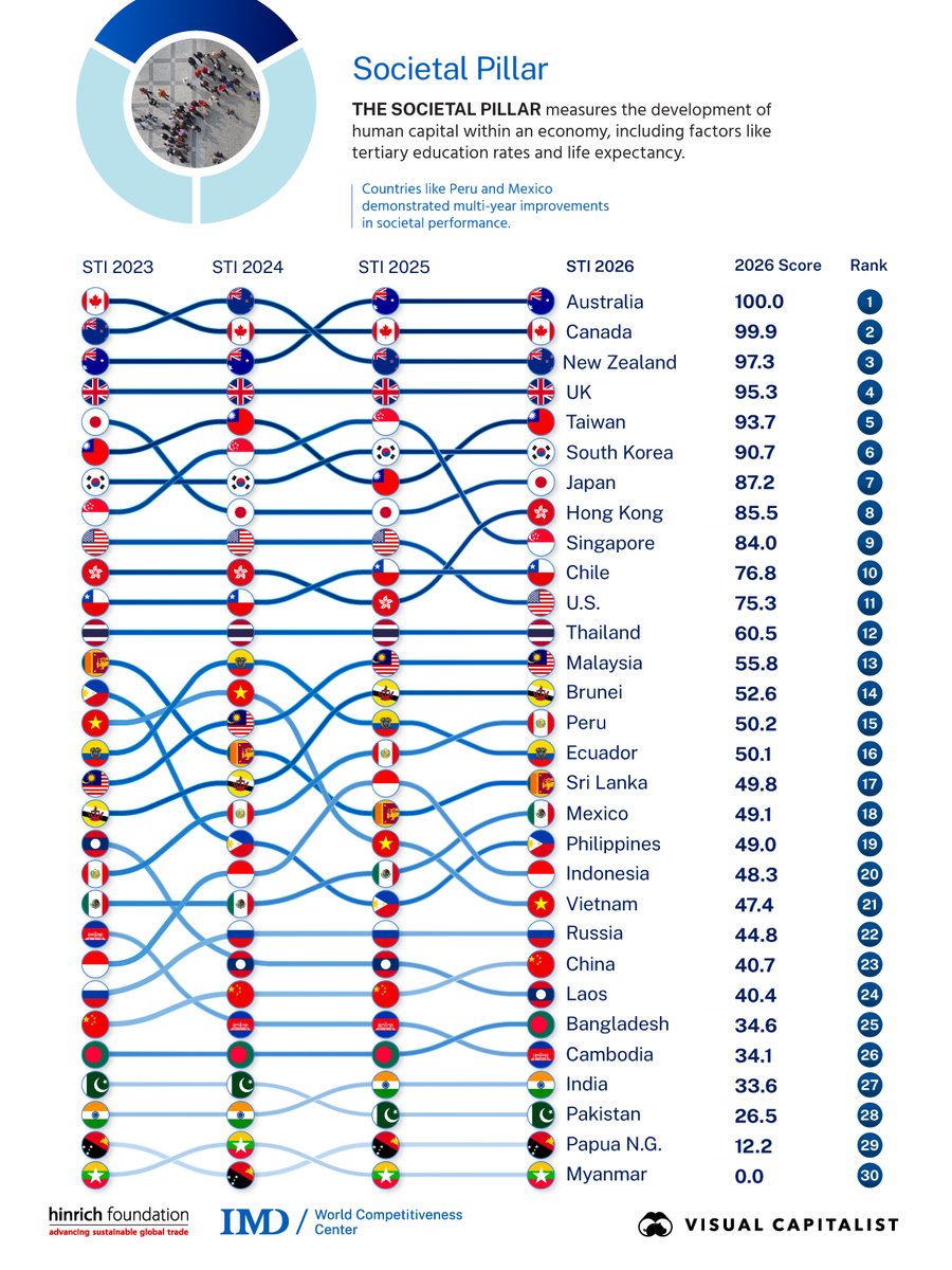
- How are economies navigating the balance between global trade and long-term sustainability? 🌍 Our partner, @hinrichfdn, has released the 2026 Sustainable Trade Index, examining economic, societal, and environmental dimensions of sustainable trade across 30 economies. Explore and download the full 2026 report:


 7198915.4K
- The World’s Largest Militaries, by Four Different Measures 🪖
 64628257.1K
- Mapped: The Cost of Raising a Child in Every U.S. State 👶
 62112117K
- Ranked: The World’s Most and Least Indebted Countries in 2026 💰
 53114528.9K
- How Hard Is It to Get Into Each Ivy League School? 🎓
 42514843.3K
- Sunday Digest 📊 Which countries have the world's largest economies in 2026? Are Americans getting richer since to 2000? And which countries owe the most debt to China? Swipe through for some of this week’s featured data stories. 📩 Want the full week in data? Subscribe to Visual Capitalist’s free daily newsletter to get our latest stories and visuals delivered straight to your inbox.


 2137615.1K
- The U.S. Industries Gaining and Losing the Most Jobs 💼
 3248712.7K
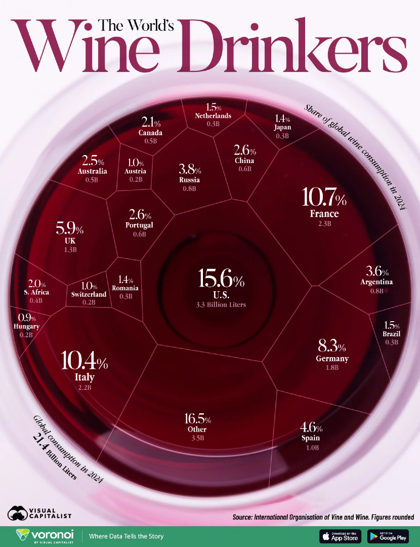
- Flashback Favorite 🔙 Ranked: Countries that Drink the Most Wine 🍷 From the Archive:
 42212726.7K
- Ranked: The Top Currencies Used in Global Payments 💱 This graphic by Aneesh Anand is one of the many incredible data-driven charts and stories from creators featured on our @VoronoiApp. ✅
 13611613.9K
- Mapped: Are Americans Getting Richer Since 2000? 💰
 103117339.3K
- Mapped: How Many Starbucks Stores Are in Each Country? ☕ This graphic by Iswardi Ishak is one of the many incredible data-driven charts and stories from creators featured on our @VoronoiApp. ✅
 53413017.3K
- Just 10 countries account for nearly half of global food exports 🌾 The U.S., Brazil, and Canada are among the biggest players in agricultural trade, while the top 30 exporters account for more than 80% of the $1.5 trillion global market. Read more:1103311.3K
- Helium-3 is roughly 150x more valuable than gold ⚛️ As demand for this rare isotope grows, learn how our partner @pulsarhelium is working to develop a scalable supply of ³He here on Earth. Discover Pulsar’s helium-3 project:
 12189.8K
- Visual of the Week 🥇 China, the United States, and India account for more than half of global greenhouse gas emissions. China alone contributes 30.3% of the worldwide total.
 243411922K
- Berichten @VisualCapWhile a few countries account for most global emissions, the pace of change tells a different story. 🌍 Vietnam's CO₂ emissions rose 106% from 2014 to 2024, while the UK, Germany, and Japan recorded declines of over 20%. See where emissions are rising and falling fastest:03116.5K