Posts with #ColorCodes

#ColorCodes

Public posts on X that use #ColorCodes.

Related hashtags

  1. AppleUniversityRo✓@madalina_gutu
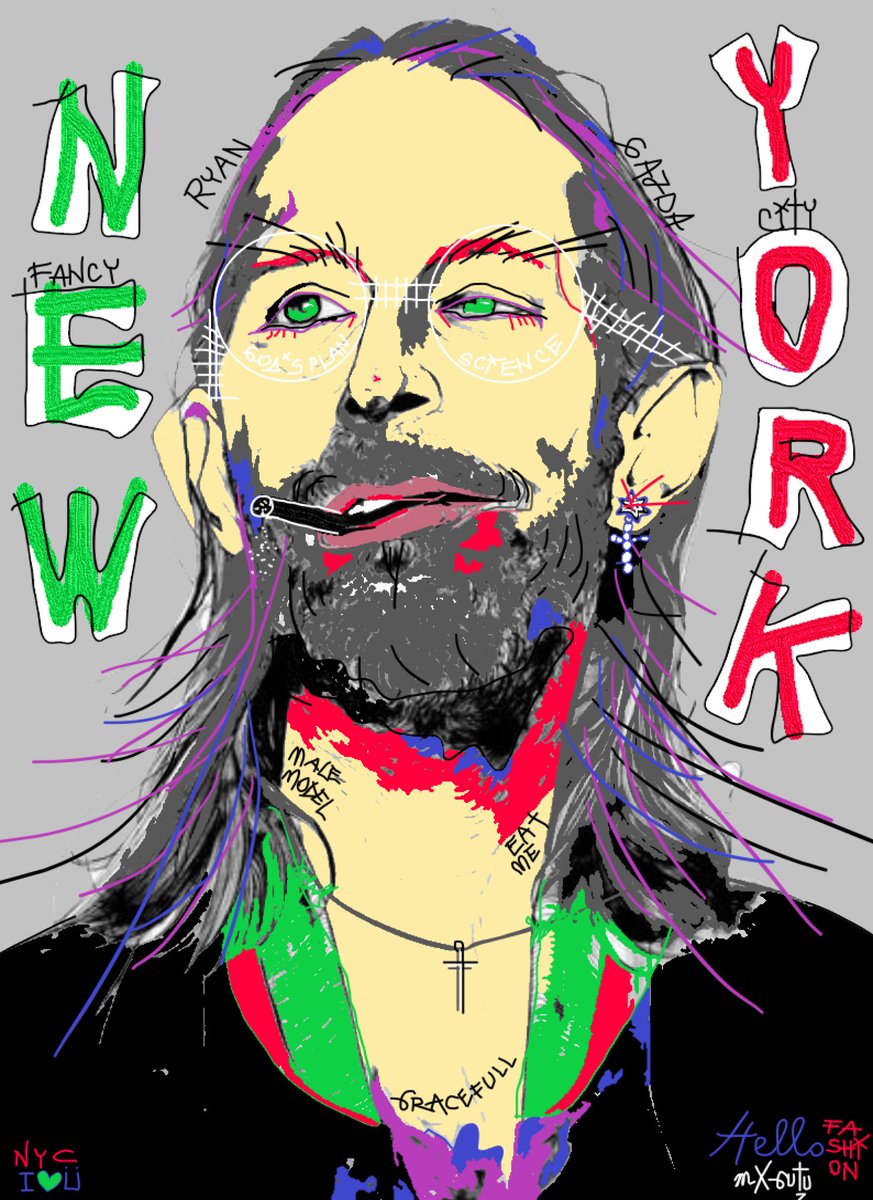
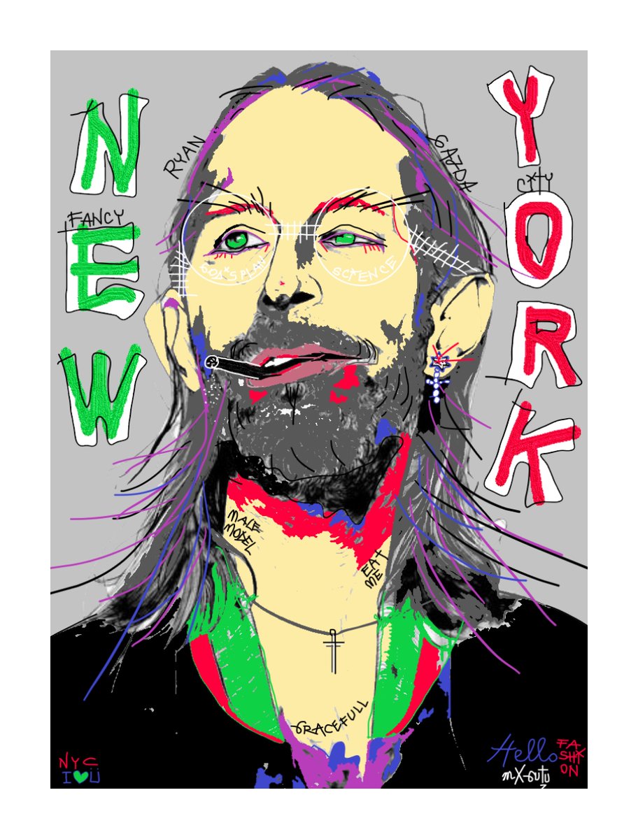
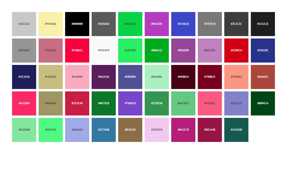
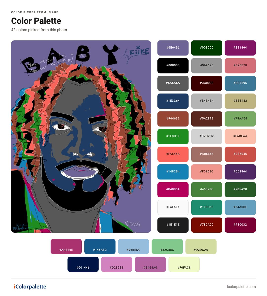
    #colorcodes #digitalart #illustration #appleuniversityro #simplytexgoglobal #mxgutu The image in the post is a colour-palette extraction (via iColorpalette) of 42 colours taken from a bold digital portrait illustration. The palette is high-contrast and graphic, built for pop-art / street-art style work rather than naturalistic rendering.⁠ Overall character The dominant family is cool-to-neutral with strong saturated accents. Deep purples, blue-greys, and charcoal form the structural base (face, outlines, background). Bright coral, lime-green, magenta and turquoise provide the energetic hair and clothing highlights. Neutrals (black, steel grey, off-white) keep the contrast clean and the shapes readable. Key colour groups Structure & background: deep violet/purple (#6E6496, #821464), blue-grey (#5A5A5A, #969696), pure black (#000000, #1E1E1E) and charcoal. Skin & mid-tones: cool blue-grey and muted teal-blue (#1E3C64, #3C7896, #1482B4). Hair & energy accents: coral/pink (#D26E78, #FA645A), lime and forest green (#78AA64, #1E8C1E, #46823C), turquoise and bright blue. Warm and soft accents: dusty rose, beige, peach (#BEB482, #FABEAA, #D2D2D2) and a few burgundy/red-brown tones. Additional bottom row: magenta (#AA326E), navy (#145A8C), light blue (#96BEDC), sage (#82C88C), cream (#D2DCA0), plus deeper navy, pink, and pale yellow. Mood and use The palette feels contemporary, graphic, and slightly retro-pop. High saturation in the pinks/greens/blues against strong darks creates visual punch suitable for music-related illustration, bold branding, or editorial design. Lighter pinks and blues give breathing room while the blacks and deep purples supply definition and drama. The extracted set closely tracks the flat colour blocks and energetic line work of the original portrait.
    Download
    004127
  2. AppleUniversityRo✓@madalina_gutu
    #colorcodes #digitalart #illustration #appleuniversityro #simplytexgoglobal #mxgutu Color palette description from the illustration in the post (21 colours extracted via iColorpalette): The palette is built around a bold, graphic illustration style. The dominant skin tone is a soft bubblegum pink (#FAC8E6 / #F06E96 / #E6A0BE), set against deep black hair and outlines (#000000, #1E1E1E). Supporting tones include muted greens and olives (#467864, #6E8C82, #646E3C, #285046, #A0AA6E), warm maroons and burgundies (#5A001E, #823250, #50323C, #8C5A6E), plus lighter neutrals (#A0A0A0, #BEBEC8, #FAFAFA, #F0F0C8) and small accents of light blue (#82B4C8) and pale yellow-green (#D2DCA0). Overall character: high-contrast, slightly retro/pop-art feel with strong pink-to-black contrast, earthy green supporting colours, and limited cool accents. The greens and olives appear mainly in the background and eye details, while the pinks dominate the face.
    Download
    00457
  3. AppleUniversityRo✓@madalina_gutu
    #velvetnightgarden #vintagebotanicalillustration #colorcodes #appleuniversityro #simplytexgoglobal Vintage botanical illustration combines scientific accuracy with artistic elegance. It flourished from the 16th to 19th centuries, especially during the age of exploration and the rise of scientific publishing. Core Techniques 1. Observation & Preliminary Drawing: Artists studied live plants or dried herbarium specimens intensely, often over multiple seasons. They measured proportions carefully (frequently aiming for life-size or exact scale) and recorded every diagnostic feature: leaf venation, petal structure, stamens, roots, seeds, and cross-sections. Initial sketches were done in graphite or ink, with careful attention to perspective (flowers appear more oval when turned away from the viewer). 2. Line Work & Shading Fine outlines in pen and ink. Hatching and cross-hatching for form and shadow. Stippling (dots of varying density) — a signature technique especially refined by Pierre-Joseph Redouté. Stippling creates soft tonal gradations without harsh lines and was ideal for both original drawings and engraving plates. Light was conventionally assumed to come from the upper left, so the lower-right areas received deeper shadow, though translucent petals could show transmitted light even on the “shadow” side. 3. Coloring Methods: Transparent watercolor was the dominant medium. Artists built color through multiple delicate washes rather than opaque layers, allowing the white of the paper (or vellum) to create luminosity. Occasional touches of body color (gouache) added highlights or sheen on petals and leaves. These processes explain the characteristic fine lines, slightly raised ink texture, and delicate hand-applied color seen in antique botanical prints. Redouté’s celebrated style and used pure watercolor with extremely subtle gradations, learned partly from Gerard van Spaendonck. 4. Reproduction Techniques (what made the “vintage prints”) Most famous botanical plates were not unique paintings but printed editions: Early: woodcuts. 16th–18th centuries: copperplate engraving and etching. Late 18th–early 19th centuries: stipple engraving (Redouté’s preferred method), which allowed finer tonal control. Hand-coloring of the black-and-white prints by teams of colorists. Later: lithography and chromolithography for multi-color printing. These processes explain the characteristic fine lines, slightly raised ink texture, and delicate hand-applied color seen in antique botanical prints. Materials High-quality paper or vellum, fine sable brushes, and carefully prepared pigments. Vellum was prized for its smooth surface and archival quality. Connection to the Fabric Patterns The floral textiles in our conversation deliberately echo these traditions: strong dark grounds, precisely outlined petals with internal detailing, limited but vivid color accents, and a sense of scientific yet decorative precision. They translate the refined line work and controlled color of 18th–19th-century botanical plates into repeating surface design.
    Download
    005119
  4. AppleUniversityRo✓@madalina_gutu
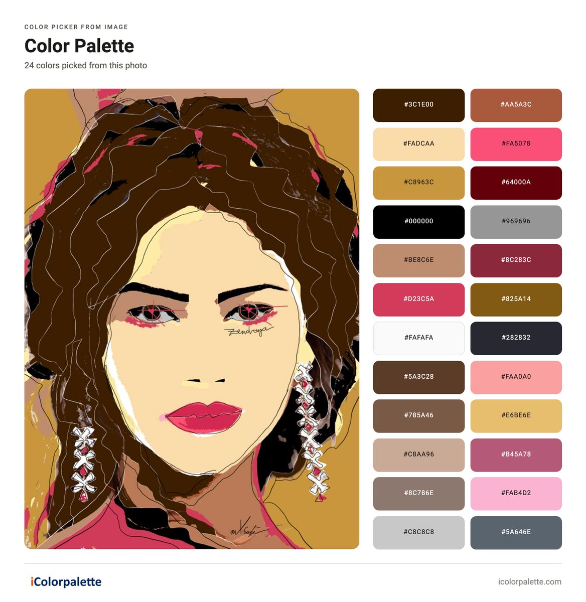
    #colorcodes #digitalart #illustration #appleuniversityro #simplytexgoglobal #mxgutu The colour palette extracted from the digital illustration is a warm, high-contrast scheme of 24 colours, dominated by earthy browns, golds, and rich pinks/reds, with supporting neutrals.⁠ Key characteristics: Warm earth tones and golds form the foundation (e.g. deep browns like #3C1E00 and #5A3C28, golden yellows such as #C8963C and #E6BE6E, and the mustard background). These define the hair, background, and mid-tones. Vibrant pinks and reds provide accents (notably #FA5078, #D23C5A, #FAA0A0, and #FAB4D2), used for the lips, eye details, and highlights. Neutrals and contrast include black (#000000), dark navy/charcoal (#282832), greys (#969696, #C8C8C8, #5A646E), creams (#FADCAA, #FAFAFA), and deep maroons (#64000A, #8C283C). Overall mood: dramatic and stylised, with strong dark outlines against luminous skin and warm background tones, typical of vector-style or digital portrait illustration. The palette is balanced for graphic impact rather than naturalistic rendering.
    Download
    00427
  5. AppleUniversityRo✓@madalina_gutu
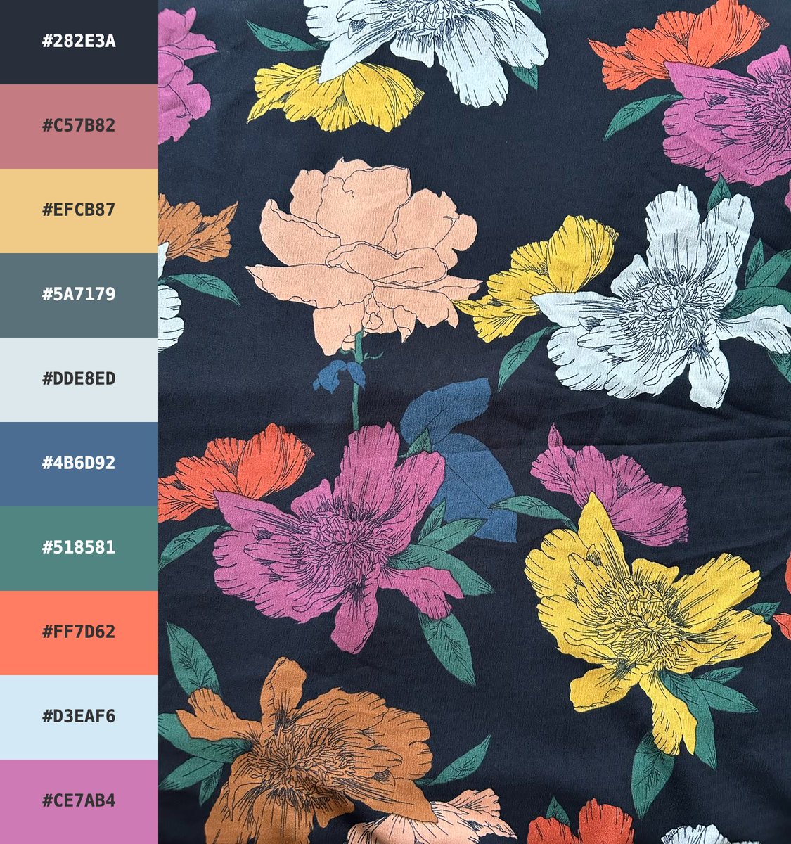
    #darkfloralelegance #colorcodes #appleuniversityro #simplytexgoglobal Here is how you can effectively apply the color palette shown in the image (the one with a dark background and colourful flowers) to your design: 1. Color roles (basic structure): Background / dominant color: #282E3A (blue-black) Use this for backgrounds, headers, cards, or large areas. It creates an elegant, modern look. Secondary/neutral colors: #5A7179, #4B6D92, #DDE8ED, #D3EAF6 Perfect for text, borders, secondary backgrounds, icons, and content areas. Accent colors (attention-grabbing): #FF7D62 (coral), #EFCB87 (golden yellow), #C57B82 (dusty pink), #CE7AB4 (purplish-pink), #518581 (teal) Use these for buttons, links, highlights, illustrations, or decorative details.
    Download
    00546
  6. AppleUniversityRo✓@madalina_gutu
    #colorcodes #digitalart #illustration #appleuniversityro #simplytexgoglobal #mxgutu The colour palette extracted from the digital illustration (via iColorpalette) is a bold, high-contrast set of 24 colours dominated by saturated reds and pinks, cool blues, and neutral greys/blacks.⁠ Overall Character Dominant family: Warm reds, magentas, and pinks (e.g. Scarlet Apple #8C2846, Deep Hibiscus #C81446, Cherry Lolly #D23C64, Pink Garnet #D26E8C, Love At First Sight #E6AAB4). These create the strong, graphic pop against the illustration’s pink background. Cool accents: Mid-to-dark blues and teals (Dark Cobalt #003250, Lucario Blue #1482B4, Carbide #286482, Dirty Blue #4682A0, Serene Sea #78AAC8, Thalassophile #46AADC, Seashore Dreams #B4DCF0). Neutrals & structure: Pure black (#000000), charcoal, steel greys, and off-whites (Zinc White #FAFAFA, Matte Silver #B4B4B4, Spanish Grey #969696, Wood Charcoal #464646, Dire Wolf #282828) that define the hair, outlines, and facial structure. Deeper accents: Burgundy/black-cherry tones (Deep Burgundy #6E001E, Black Cherry #32000A) and a single purple (Purple Magic #6E3C78). Mood and Use The palette feels graphic, contemporary, and slightly retro-pop—high saturation in the reds/pinks paired with crisp blues and strong blacks produces a clean, fashion-illustration aesthetic. It works well for bold branding, editorial design, or digital art where strong contrast and a feminine-yet-edgy feel are desired. The lighter pinks and blues provide breathing room, while the darks give definition and drama. The source image is a stylised female portrait (long black hair, red lips, graphic eye makeup, signature visible), so the extracted colours closely track the illustration’s flat colour fields and line work.
    Download
    004123
  7. AppleUniversityRo✓@madalina_gutu
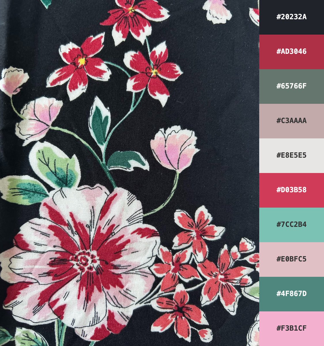
    #velvetnightgarden #vintagebotanicalillustration #colorcodes #appleuniversityro #simplytexgoglobal This is a close-up of a dark floral fabric print on a near-black background (#20232A). Main visual elements: A large, bold flower in the lower-left (white petals heavily edged and veined in deep red/crimson). Clusters of smaller flowers in vivid red with white tips, soft pink buds, and delicate blossoms. Green leaves and stems with some lighter variegation. The overall style is classic, slightly vintage botanical, with strong contrast against the black ground. Color palette (shown on the right, from top to bottom): Hex + Color Description #20232A Near-black / dark charcoal #AD3046 Deep crimson red #65766F Muted sage green-gray #C3AAAA Dusty mauve / soft rose #E8E5E5 Light cool gray #D03B58 Bright raspberry red #7CC2B4 Fresh mint teal #E0BFC5 Soft pastel pink #4F867D Teal green #F3B1CF Light bubblegum pink The palette combines dramatic dark tones with rich reds, soft pinks, and calming teals/greens, creating an elegant yet vibrant floral mood.
    Download
    00597
  8. AppleUniversityRo✓@madalina_gutu
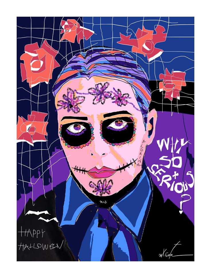
    #colorpalette #colorcodes #digitalillustration #digitalart #appleuniversityro #simplytexgoglobal The colour palette accompanying the Halloween digital illustration is a high-contrast mix of deep, moody tones and vibrant accents, dominated by blues, purples, pinks, and reds. It features dark foundations such as Void Blue (#060607), Grim Reaper (#0C0E3A), Royal Violet Ink (#2A156F), and Chrysomela Goettingensis (#39334C), balanced by electric highlights like Electric Azure Glow (#4B90FD) and The Oregon Blue (#5586DB). Pink and red tones appear throughout, including Nakabeni Pink (#CD3C59), Jinzamomi Pink (#F9655B), Blushing Blossom (#FDAEC7), and Highlight Red (#DA6B72), with softer pastels such as Shampoo (#FED0F0) and Pale Primrose (#EFCAD4) providing lighter relief. The overall scheme feels gothic yet playful—suited to the sugar-skull makeup and “Why so serious?” theme—combining somber depth with saturated, candy-like vibrancy typical of digital illustration work.
    Download
    00345
  9. AppleUniversityRo✓@madalina_gutu
    #darkfloralelegance #colorcodes #appleuniversityro #simplytexgoglobal The image displays a stylized floral pattern set against a dark background (near-black/navy). Large, colorful flowers in various shades (pink/magenta, yellow, orange, white, peach, reddish-brown) feature fine outlines and are accompanied by green leaves. The pattern resembles a woven fabric or textile print. On the right side, there is a vertical bar displaying a color palette extracted from the image, including the following HEX codes (from top to bottom): #282E3A (dark blue) #C57B82 (dusty pink) #EFCB87 (golden yellow) #5A7179 (blue-gray) #DDE8ED (light gray) #4B6D92 (medium blue) #518581 (teal green) #FF7D62 (coral orange) #D3EAF6 (pale blue) #CE7AB4 (pinkish-purple) It is a decorative design typical of color inspiration, textiles, or branding.
    Download
    00583
  10. Jens Eisert✓@jenseisert
    @jenseisert
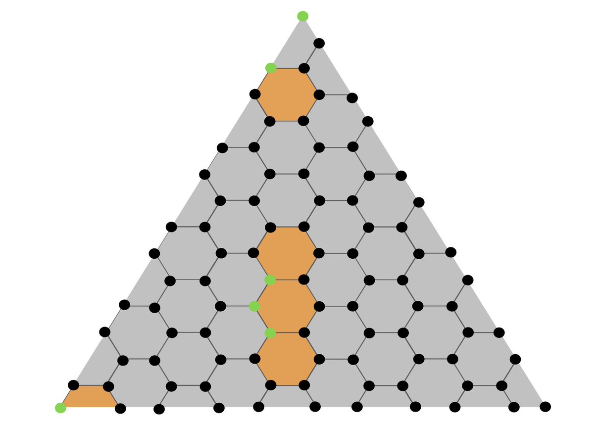
    Decoding is seen as emerging from a reading of the #LightsOut puzzle. We propose a novel decoder for quantum #colorcodes featuring high thresholds using a formulation as a MaxSAT problem based on this analogy.
    108572
  11. Show more posts